
T-SHIRT DESIGN
TYRELL HOUSE INTRAMURALS T-SHIRT DESIGN: TURNING SCHOOL SPIRIT INTO SOMETHING STUDENTS ARE PROUD TO WEAR

THE PROBLEM
Event shirts often lack readability and impact. Designs fail when viewed from a distance or in crowds. Existing intramural shirts lacked visibility, clarity, and strong identity.
OBJECTIVE & TARGET AUDIENCE
Objective: Create a bold, readable, and wearable design in theme (Tyrell House). Build a strong visual identity that promotes unity and team spirit.
Audience: High school students and staff.
SOLUTION / STRATEGY PROCESS
-
Explored typography-driven concepts emphasizing strength and unity.
-
Tested contrast levels for real-world wear scenarios.
-
Prepared alternate colorways for different shirt bases.
-
Created mockups to visualize student wear and event presence.
FINAL OUTCOME / RESULTS
-
Achieved high readability in outdoor and crowded environments.
-
Maintained visual impact across light and dark shirt colorways.
-
Optimized for bulk printing and real student and staff wear.
-
Turned the school pride into a wearable identity that unified students, increased visibility during events, and strengthened house recognition.
.png)

INFOGRAPHICS
RESEARCH FORUM AI THESIS INFOGRAPHIC: MAKING COMPLEX RESEARCH CLEAR ENOUGH TO BE UNDERSTOOD AND REMEMBERED

THE PROBLEM
AI research content is often too technical and overwhelming. Non-technical audiences struggle to engage or understand. Complex AI information lacked clarity and accessibility for broader audiences.
OBJECTIVE & TARGET AUDIENCE
Objective: Make AI concepts easy to understand and visually engaging. Transform complex AI research into digestible, audience-friendly visuals.
Audience: Students, educators, researchers, and non-technical attendees.
SOLUTION / STRATEGY PROCESS
-
Structured layouts with strong hierarchy.
-
Created consistent icons and modular sections.
-
Assured print and digital adaptability.
-
Designed a structured infographic system prioritizing clarity over complexity.
FINAL OUTCOME / RESULTS
-
Simplified complex AI topics into structured, easy-to-follow visuals
-
Improved information flow for both print displays and digital screens
-
Enabled audiences to understand key ideas without technical background
-
Achieved an award and public recognition as the 2nd place Best Infographics in Research Forum by applying all the solution or strategy process.

.png)
SOCIAL MEDIA CONTENTS
LUME APPAREL SOCIAL MEDIA CONTENT PACKAGE: BUILDING A VISUAL RHYTHM THAT KEEPS A BRAND CONSISTENT, CURRENT, AND SEEN

THE PROBLEM
Brands that post inconsistent visuals struggle to build recognition and engagement. Without a clear visual system, content becomes forgettable in fast-moving social feeds.
OBJECTIVE & TARGET AUDIENCE
Objective: Increase brand awareness and engagement through consistent, visually aligned social media content.
Audience: Gen Z and young millennials active on social media apps.
SOLUTION / STRATEGY PROCESS
-
Defined visual rules for spacing and hierarchy.
-
Designed multiple static post variations.
-
Ensured alignment across all posts for immediate recognition.
-
Maintained enough flexibility for content variation without breaking brand consistency.
FINAL OUTCOME / RESULTS
-
Made brand messages easier to understand within seconds of scrolling.
-
Helped audiences quickly recognize and remember the brand in crowded social feeds.
-
Supported the brand assess which content formats perform best through clear visual structure.
-
Transformed scattered content into a cohesive system that supports long-term brand growth and conversion.
.png)
.png)
.png)
.png)
.png)
.png)
.png)
.png)
.png)
STATIC ADVERTISEMENT
MOOD MUNCHIES STATIC AD: DESIGNING TRUST FIRST, SO PARENTS FEEL CONFIDENT SAYING YES

THE PROBLEM
Kids’ products must appeal to children and parents. Too playful loses trust and too clinical loses interest. The challenge was balancing fun visuals with parental credibility.
OBJECTIVE & TARGET AUDIENCE
Objective: Promote emotional wellness through a static ad.
Audience: Parents and children.
SOLUTION / STRATEGY PROCESS
-
Explored soft pastel palette with red accents.
-
Planned a clear product-centered layout.
-
Established a child-safe typography and icons.
-
Designed a calm, approachable ad that keeps the product as the focus.
FINAL OUTCOME / RESULTS
-
Balanced a visually engaging yet trustworthy static advertisement.
-
Achieved suitability for digital campaigns.
-
Supported confident purchase decisions by making the product and its value easy to evaluate at a glance.
-
Helped parents and children immediately recognize the product and its emotional wellness purpose.

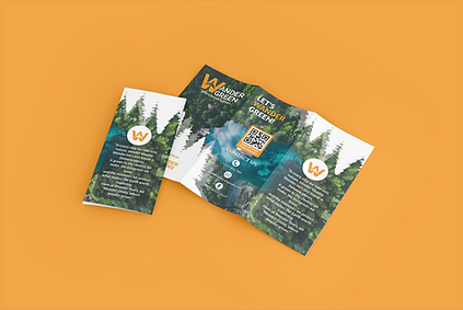
TRI - FOLD BROCHURE
WANDER GREEN ECO - TOURISM TRI - FOLD BROCHURE: TURNING SUSTAINABLE TRAVEL INTO A STORY PEOPLE WANT TO STEP INTO

THE PROBLEM
Eco-tourism brands often struggle to balance information and inspiration. Too much text overwhelms readers, while weak visuals fail to communicate values. Wander Green needed a brochure that informed without feeling heavy and inspired without feeling superficial.
OBJECTIVE & TARGET AUDIENCE
Objective: Communicate eco - tourism offerings clearly while building trust and emotional connection.
Audience: Eco - conscious travelers aged 18 – 35 seeking meaningful, responsible travel experiences.
SOLUTION / STRATEGY PROCESS
-
Analyzed traveler behavior to structure information for fast, intuitive scanning.
-
Designed a clean visual hierarchy to guide readers through destinations, values, and activities.
-
Integrated nature - inspired color systems to reinforce sustainability and calm.
-
Balanced imagery and typography to keep the brochure informative yet inviting.
FINAL OUTCOME / RESULTS
-
Transformed complex travel information into a brochure that feels easy, calm, and purposeful.
-
Enabled the brand to communicate credibility and responsibility at first glance.
-
Demonstrated a print system ready for real-world distribution and client presentations.
-
Positioned Wander Green as a trustworthy eco-tourism option that converts curiosity into intent.
.png)
.png)
.png)
.png)
.png)
.png)
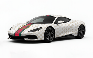
SUPER CAR VINYL WRAP
GUCCI X LAMBORGHINI COLLAB VINYL WRAP: THE ROAD BECOMES A RUNWAY

THE PROBLEM
Luxury collaborations often fail when visual identities clash. Without balance, one brand overpowers the other, weakening the collaboration’s impact. This project required harmony between speed, prestige, and visual dominance.
OBJECTIVE & TARGET AUDIENCE
Objective: Create a striking vinyl wrap visual concept that honors both brands while commanding attention.
Audience: Luxury consumers, car enthusiasts, and high-end brand followers.
SOLUTION / STRATEGY PROCESS
-
Synthesized Gucci’s luxury language with Lamborghini’s aggressive form.
-
Designed bold graphic placements that complement the car’s natural lines.
-
Controlled contrast and spacing to maintain elegance under high visual intensity.
-
Applied brand cues selectively to avoid visual overload.
FINAL OUTCOME / RESULTS
-
Delivered a concept that visually communicates exclusivity and power instantly.
-
Showcased how fashion branding can live seamlessly on automotive surfaces before undergoing vinyl wrapping the vehicle.
-
Demonstrated adaptability of luxury graphics in real-world, large-scale applications.
-
Positioned the design as campaign-ready for exhibitions, launches, and social media.
.png)
.png)
.png)
.png)
.png)
.png)
.png)
RE - DESIGN
BRICKYARD CAFÉ MENU REDESIGN: CLEARING THE NOISE SO GREAT FOOD AND FLAVORS LEAD

THE PROBLEM
Outdated menus confuse customers and weaken brand experience. Brickyard’s existing menu lacked hierarchy, consistency, and a visual identity aligned with a younger audience.
OBJECTIVE & TARGET AUDIENCE
Objective: Improve readability while reinforcing a modern café brand.
Audience: Young adults and casual café-goers seeking aesthetic, comfortable dining spaces.
SOLUTION / STRATEGY PROCESS
-
Reorganized menu content to reduce decision fatigue.
-
Established clear typographic hierarchy for fast comprehension.
-
Aligned layout and spacing with modern café branding.
-
Refined visual balance to keep focus on products, not clutter.
FINAL OUTCOME / RESULTS
-
Improved menu clarity, making ordering faster and more intuitive.
-
Elevated the café’s perceived quality through clean, intentional design.
-
Demonstrated how design directly supports customer experience.
-
Created a menu system ready for in-store use and future brand growth.
OLD DESIGN
.png)
NEW DESIGN
.png)
.png)
.png)
.png)
.png)
.png)
.png)
.png)
PRODUCT POSTERS
.png)
THE ORDINARY: CLARITY OVER HYPE
Honoring a brand built on radical transparency and ingredient integrity. This poster solves skincare skepticism by visually rejecting hype—using deliberate minimalism to translate their "clinical credibility" philosophy into an immediate, unshakeable trust that converts curiosity into loyalty.
GATORADE: FUEL EVERY MOVE
Channeling a brand rooted in athletic science and peak performance. This high-energy visual solves for instant impact in crowded environments by visualizing their core promise—optimal hydration equals unlocked potential. It turns a beverage into a symbol of momentum, making the brand synonymous with ambition in motion.
.png)
.png)
APPLE: THINK DIFFERENT. HEAR SEAMLESSLY
Embodying Apple's ethos of challenging the status quo through human-centered design. This poster solves the "specification overload" problem by focusing on the experiential philosophy: technology should feel intuitive and inevitable. It frames AirPods not as a device, but as the natural result of designing for a frictionless life.
STARBUCKS: SIP THE MOMENT
Embracing Starbucks' mission to be a "third place" between work and home. This poster solves the commodity trap by visualizing their brand of connection and personal reward. It transforms a drink into an emotionally-charged ritual, selling not only a flavor matcha but also a moment and new offer of vibrant warmth and indulgent respite that customers are drawn to again and again.
.png)
YOUTUBE THUMBNAILS
.png)
ALI ABDAAL: STUDY SMARTER, NOT HARDER
Reflecting a channel built on the principle of evidence-based productivity. This thumbnail solves viewer overwhelm by visually distilling his philosophy: efficiency is systematic, not strenuous. It acts as a clear, trustworthy gateway, promising a practical path to better results and converting scrollers into committed learners.
.png)
GRAHAM STEPHEN: FINANCE, UNCOMPLICATED
Mirroring a brand dedicated to demystifying wealth. This thumbnail solves financial intimidation by projecting his core belief: clarity breeds confidence. Its clean, professional design translates complex topics into accessible, click-worthy value, attracting viewers who seek authority without arrogance.
.png)
DR. SAM ELLIS: SKINCARE ADVICE YOU CAN TRUST
Upholding a channel founded on dermatological authority and science over trends. This thumbnail solves digital misinformation by visually anchoring his "evidence-over-anecdote" branding. It builds instant credibility, helping viewers bypass noise and choose expert guidance with confidence.
.png)
CHRIS HIERA: COMMIT TO THE CHANGE
Channeling a brand rooted in the transformative power of discipline. This thumbnail solves motivational friction by visualizing his core tenet: consistency is power. It's crafted as a visual catalyst, turning aspiration into urgent action and attracting viewers ready to invest in their own transformation.
PROFILE BANNERS
.png)
MR BEAST: BIG IDEAS. BIG IMPACT.
Embodying a mission driven by monumental generosity and positive disruption. This banner solves the challenge of scaling heart. It visualizes his core belief and one of his branding: entertainment can be a force for good, transforming a channel into a destination for participatory, awe-inspiring joy with his striking visuals as his branding.
.png)
PETER MCKINNON: CREATE WITH PURPOSE
Reflecting a brand dedicated to the craft and story behind creation. This banner solves the surface-level content trap by anchoring in his brand: artistry requires intention. It serves as a cinematic mission statement, attracting creators who value depth, craft, and meaningful impact over fleeting trends.
.png)
ELLIOT CHOY: BUILD A LIFE WITH INTENTION
Visualizing a personal brand built on mindful ambition and holistic growth. This banner solves the "hustle culture" narrative by reflecting his brand: success is sustainable, not frantic. It attracts an audience seeking a partner in purposeful progress, balancing focus with genuine lifestyle.
.png)
XQC: PURE CHAOS, CONTROLLED
Framing a brand defined by high-velocity entertainment and raw authenticity. This banner solves identity clarity in chaos by mirroring his unique philosophy: unfiltered energy, masterfully delivered. It sets a professional yet electrifying stage, promising viewers an immersive, community-driven spectacle.
IRON DEN
IRON DEN FITNESS LOGO & BRAND: FORGING A BRAND THAT LOOKS AS DISCIPLINED AS THE PEOPLE WHO TRAIN UNDER IT

THE PROBLEM
Many gym brands look generic and forgettable. Lack of clear identity weakens brand recognition. The brand needed a powerful, distinctive identity to stand out.
OBJECTIVE & TARGET AUDIENCE
Objective: Develop a strong and memorable fitness brand identity that communicates power, consistency, and commitment.
Audience: Athletes and serious fitness enthusiasts.
SOLUTION / STRATEGY PROCESS
-
Created strong visual weight to signal discipline and strength.
-
Built a logo system that scales across apparel, equipment, and social media.
-
Aligned visuals with mindset, not trends.
-
Designed a system that supports long-term brand growth.
FINAL OUTCOME / RESULTS
-
Made Iron Den instantly recognizable across equipments, apparel, and digital platforms.
-
Demonstrates how the brand can be applied consistently in real gym environments.
-
Shows how a disciplined brand identity can increase perceived credibility and trust.
-
Translates a gym concept into a real-world-ready brand system capable of attracting and retaining committed members.


BKNO
BKNO ESPORTS GAMING LOGO & BRAND: FORGING A COMPETITIVE IDENTITY ROOTED IN POWER, CULTURE, AND PRESENCE.

THE PROBLEM
Many gaming brands rely on generic visuals that lack meaning. BKNO needed an identity that felt powerful, unique, and culturally rooted while remaining modern and scalable.
OBJECTIVE & TARGET AUDIENCE
Objective: Build an iconic gaming brand that stands out visually and symbolically.
Audience: Gamers, digital natives, and competitive online communities.
SOLUTION / STRATEGY PROCESS
-
Interpreted Bakunawa mythology into a modern, abstract symbol.
-
Designed a logo system optimized for digital platforms and merchandise.
-
Simplified forms to ensure clarity at small and large scales.
-
Aligned symbolism with competitive energy and dominance.
FINAL OUTCOME / RESULTS
-
Established a distinct visual identity grounded in culture and strength.
-
Demonstrated scalability across gaming banners, avatars, and merch.
-
Positioned BKNO as a brand with story, not just style.
-
Proved readiness for real-world application in esports and online branding.


VOISEAT PODCAST
VOISEAT PODCAST LOGO & BRAND: GIVING REAL DIVERSE CONVERSATIONS A VISUAL VOICE PEOPLE RECOGNIZE INSTANTLY.

THE PROBLEM
Many podcasts blend into the feed due to weak branding. VOISEAT needed an identity that felt human, modern, and emotionally approachable.
OBJECTIVE & TARGET AUDIENCE
Objective: Create a recognizable podcast identity that resonates emotionally.
Audience: Gen Z listeners aged 18–27.
SOLUTION / STRATEGY PROCESS
-
Translated conversation and voice into visual form.
-
Designed a logo that feels approachable, not corporate.
-
Balanced personality with clarity for digital platforms.
-
Built a flexible identity for thumbnails, covers, and social content.
FINAL OUTCOME / RESULTS
-
Strengthened podcast recognition across streaming platforms.
-
Helped the brand feel more personal and trustworthy.
-
Demonstrated how branding supports audience connection.
-
Created a system ready for long-term content growth.


RIO
RIO PERSONAL BRAND LOGO & BRAND: TURNING VISION INTO VISUALS. REAL IMPACT. REAL RESULTS.

THE PROBLEM
Personal brands often feel scattered or trend-driven. I needed a clear identity that could live across design, multimedia arts, creat, and branding work that aligns with my objective.
OBJECTIVE & TARGET AUDIENCE
Objective: Position the creator and the brand as intentional, adaptable, and balancing creativity with professionalism and meaningful purpose in the design and creative industry.
Audience: Clients, collaborators, and creative industry professionals.
SOLUTION / STRATEGY PROCESS
-
Clarified personal values into a minimal, strong visual mark.
-
Designed a logo system that adapts across mediums.
-
Restricted the color system to reinforce confidence and consistency.
-
Aligned identity with long-term creative growth, not trends.
FINAL OUTCOME / RESULTS
-
Unified creative work under a single recognizable identity.
-
Strengthened professional presence across portfolio and platforms.
-
Demonstrated brand clarity that builds trust with clients.
-
Positioned RIO as a creative ready for real-world collaboration.

.png)


